Followers Book Cover
Role: Illustrator
Role: Illustrator
FOLLOWERS is about the deep, profound relationships shared among women. The novel is set in New York City. Its backdrop is a futuristic, modern world, rich with complicated and dark twists.
We are introduced to Orla and Floss who are ambitious, young, and ruthless. They will stop at nothing to achieve their goals of megastardom. Their journey parallels the future of media consumption and the obsession with celebrity. In the end, it’s ultimately an optimistic story about love, friendship, and ambition.
The invitation to illustrate the cover of FOLLOWERS was somewhat unconventional. I was brought on to the project at the request of the author, Megan Angelo. Megan had found my work through my agency representation, Lindgren & Smith. Megan was attracted to my portfolio of work as it is primarily women-focused and depicted “femaleness” as bold, bright, and modern.
The invitation to illustrate the cover of FOLLOWERS was somewhat unconventional. I was brought on to the project at the request of the author, Megan Angelo. Megan had found my work through my agency representation, Lindgren & Smith. Megan was attracted to my portfolio of work as it is primarily women-focused and depicted “femaleness” as bold, bright, and modern.
The production of the cover was a collaboration between myself and Erin Craig, the Creative Director of Trade Publishing at Harlequin in Toronto. We faced a number of design challenges. We needed to find aclever, eye catching way to present the tone of the story without spoiling the plot.
We pulled inspiration in a number of themes: love, friendship, ambition, envy, image, celebrity, fame, technology, entertainment, consumption, media, etc.
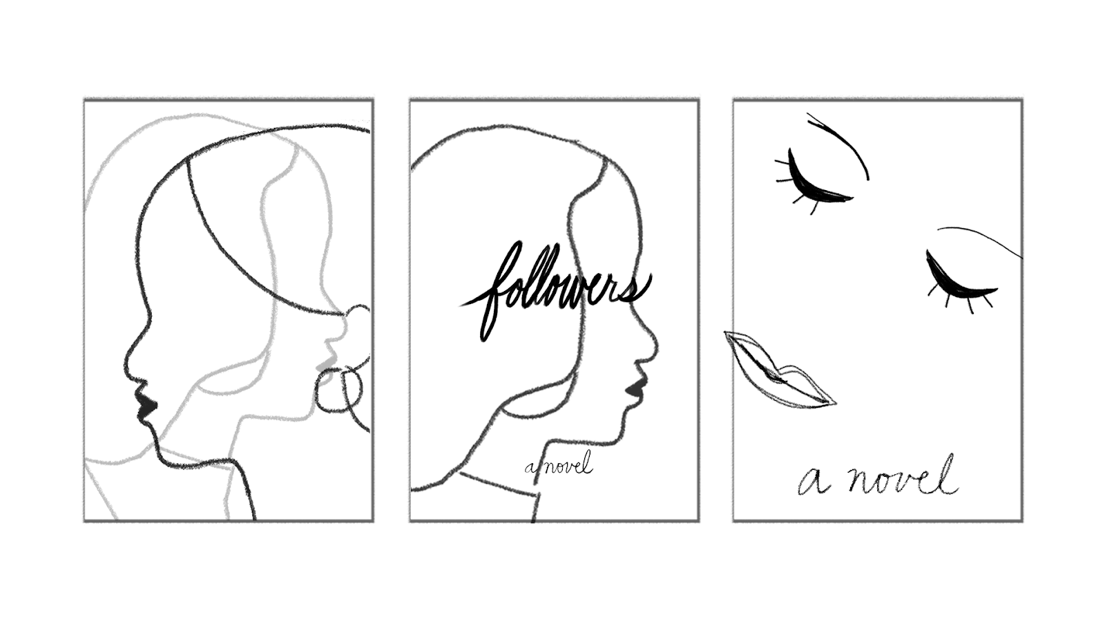
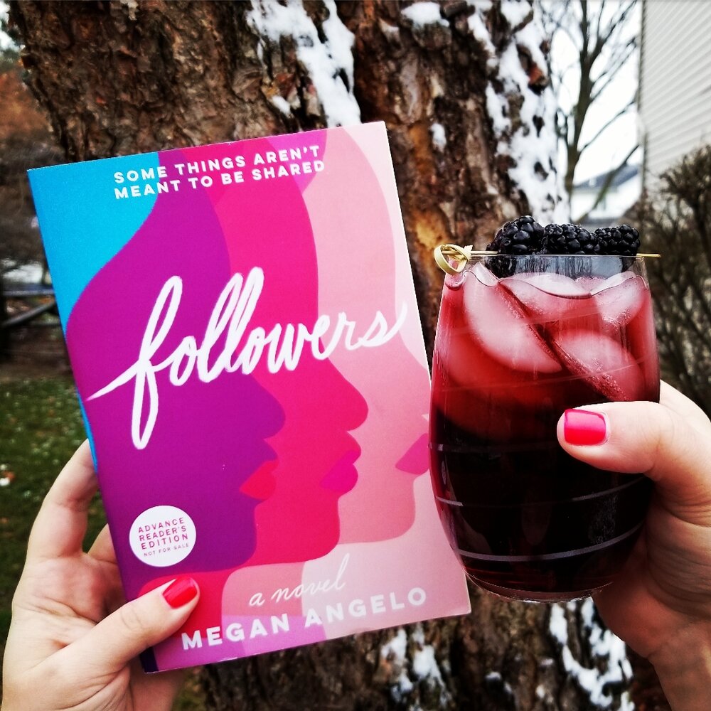
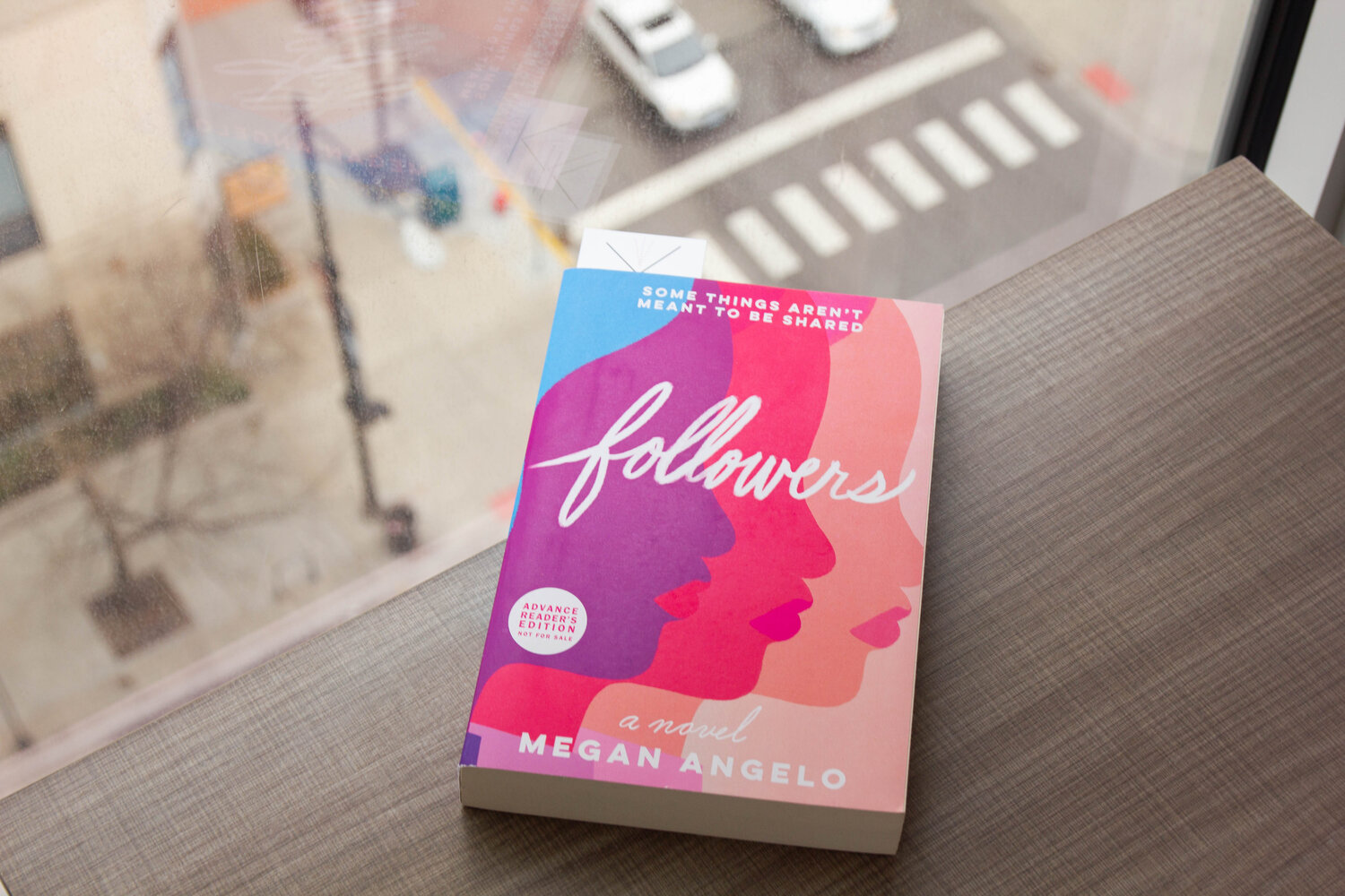
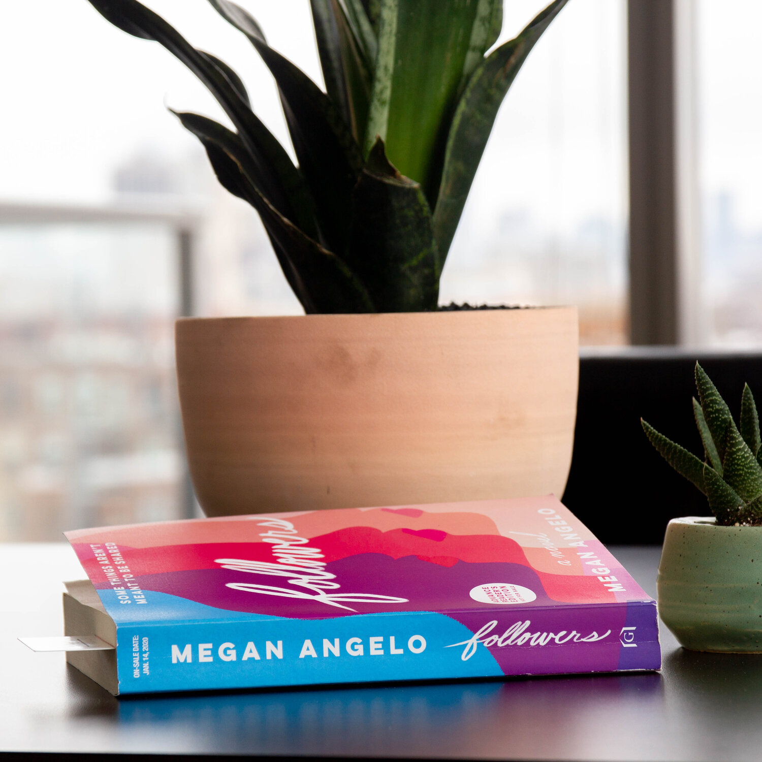
We decided on the sketch that would become the cover: A woman’s face, repeating indefinitely into the distance. The repetition of the figures speaks to overlapping aspects of the narrative. It serves as an abstract depiction of a future of digital media, all while simultaneously nodding to society’s imitation of celebrity culture.
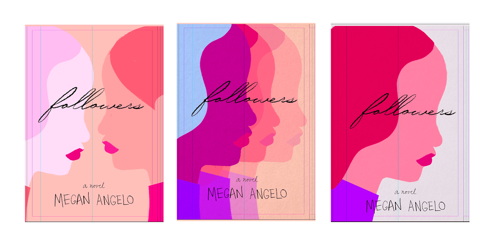
The next step in the design challenge was to solve for color. Our goal was to find a color pallet that would suite the narrative tone: modern, futuristic, and bright. The combination of colors would demand attention on a bookshelf, yet differentiate itself from other books in its genre. We decided on a striking analogous color set: blue, purple, and pink.

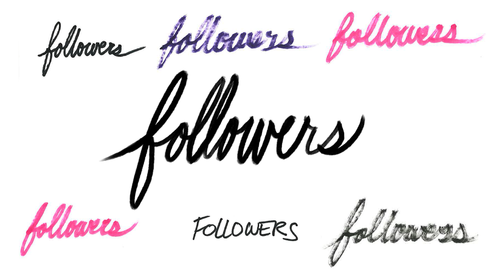
To wrap up the cover design, the title of the novel had to fit on the cover with the illustration. FOLLOWERS as a title is a single word with nine characters--It’s quite long for a single world title. We wouldn’t be able to break it up and still remain legible. I wrote the title out a number of ways using a variety of different pen types: ballpoint, felt tip, sharpie, marker, and white-board marker. In the end, we decided on a tight-knit script of the title.
The production of the cover came together in just about a week. A lighting fast turnaround that produced an exciting collaboration. There’s something special in the production of a book cover that will have a life of its own in the real world. It gives me a sense of accomplishment every time I see it in the wild.